
YP.com is the online version of the old Yellow Pages book. The brand is over 100 years old and at the time of my tenure was pushing 50M page views per month and accountable for over $400M in revenue per year. A slow downward trend began to emerge that prompted the business to start thinking about how to re-energize the product and business for a new generation. That is where me and my team came in.
I was responsible for all consumer facing experiences including YP.com desktop and mobile web products as well as the YP iOS and Android apps. I managed a team of 10 designers and 1 researcher.
MODERNIZE THE SRP
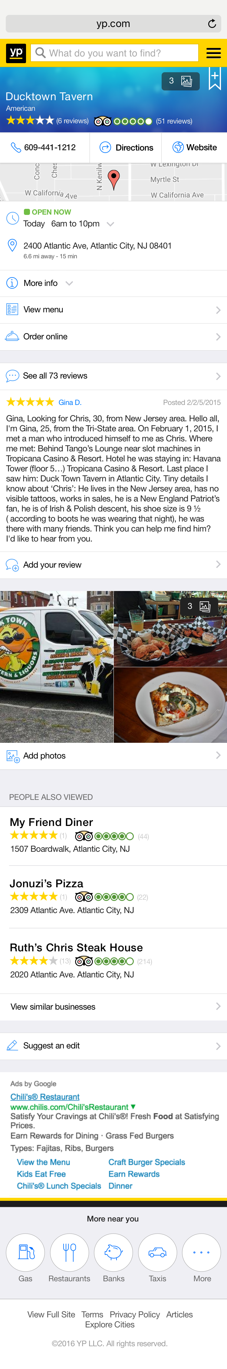
The SRP is the lifeblood of the YP.com site. It’s where the vast majority of traffic entered the site and was responsible for driving the lion’s share of the revenue. It was a delicate machine that required thoughtful and calculated design.
We also needed to get the organization to shift the way it thought about this page and the way in which it sold products to customers to appear on this page. This required us to communicate a new vision based on performance and leads-based products instead of display ad products.
This design was an effective tool to communicate the vision of a new experience and got us the organization’s buy in to begin incrementally evolving the existing SRP towards this new model.
ModernizE THE BUSINESS PROFILE PAGE
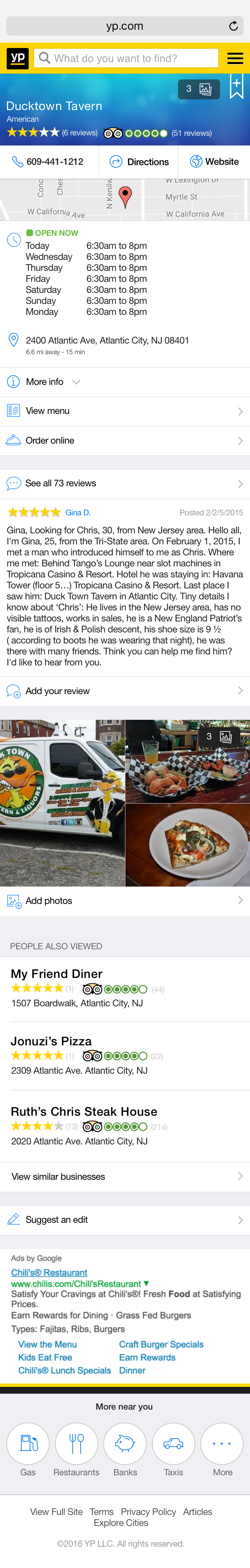
The business profile page had languished for a long time. We did deep research through quantitative analysis and qualitative user testing to understand what about the page drove value for our users. That research gave us a roadmap for how to re-architect the page and develop something more engaging for users, more effective for our customers and ultimately more beneficial to the business.
Mobile web traffic was well over 50% and never even a consideration in the original design. So we started there. The intention was to let this design also drive the design of the mobile app.
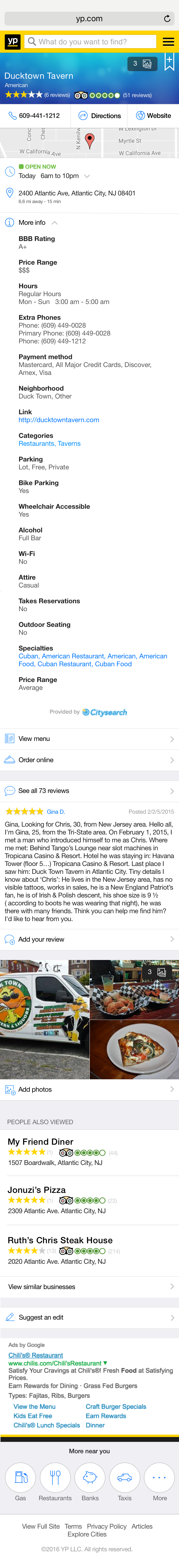

And here’s the design of the desktop profile. We made a conscious decision to go with an adaptive design, rather than a responsive design so we could deliver an optimal experience for each context. We continually refined this design, but it was a resounding success over the original.
MODERNIZING THE BRAND EXPERIENCE: Request a Quote
The Yellow Pages is known as the place to connect consumers with service providers at the point when consumers need services the most. Historically, this was done through a phone number on a display advertisement. YP needed to move away from this. The market evolved and expectations on both sides matured. This is where the request a quote feature came in. Let users contact businesses on their own time via text or email in a highly trackable conversation.
Part of my philosophy in approaching the UX practice at an organization involves enabling my team to envision the full manifestation of the company’s vision. We not only use it as a tool to communicate upwards, but we use it as a touchstone to guide and inform our decisions today.
So here’s a concept I made of what Request a Quote might look like in some future state. The goal was to communicate to my team what it is we were trying to do at a high level. I then used it to drive a practical design that we used to communicate up to the Board.
Product Strategy
Part of the way through my tenure at YP.com, we were acquired by another local search competitor Dex Media. A huge number of senior leadership and my teammates were removed from the organization. There was a lot of ambiguity about how we fit into the new organization. As one of the only senior leaders left, I believed it was my duty to initiate a conversation about how the Product and UX team could integrate into the new organization.