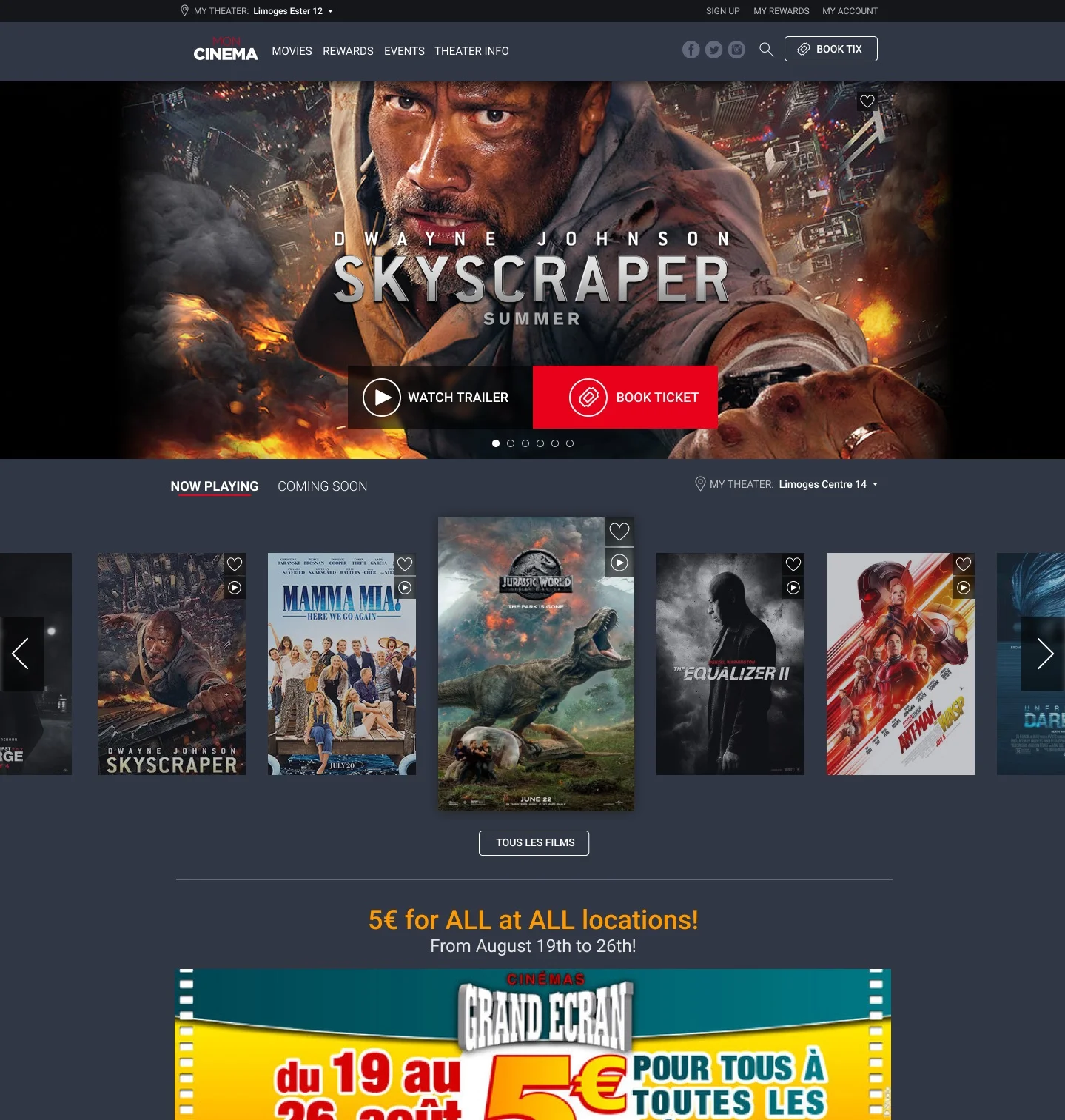
Webedia manages delivery of most of the movie showtime data you see across the internet. They also run the digital presence and ticketing platform for many small movie theater chains in the U.S. and Europe.
PRODUCT REFRESH & modernization
I was brought in to update the platform’s UX as part of its technical re-architecture. The original platform was built before mobile was a primary consideration and had long-outgrown its ability to keep up with contemporary front-end frameworks that could easily support newer interactions. The platform was so dated that integrating modern metrics software was near impossible, so we relied on heuristics and competitive analysis to inform design decisions.
I was the sole resource responsible for the desktop and mobile designs. Part of the challenge of this project was working in non-native language — a first for me. Of special note is the transaction and payment funnel which required serious rework. You would be astounded that a business successfully operated with the previous version.


TICKETing
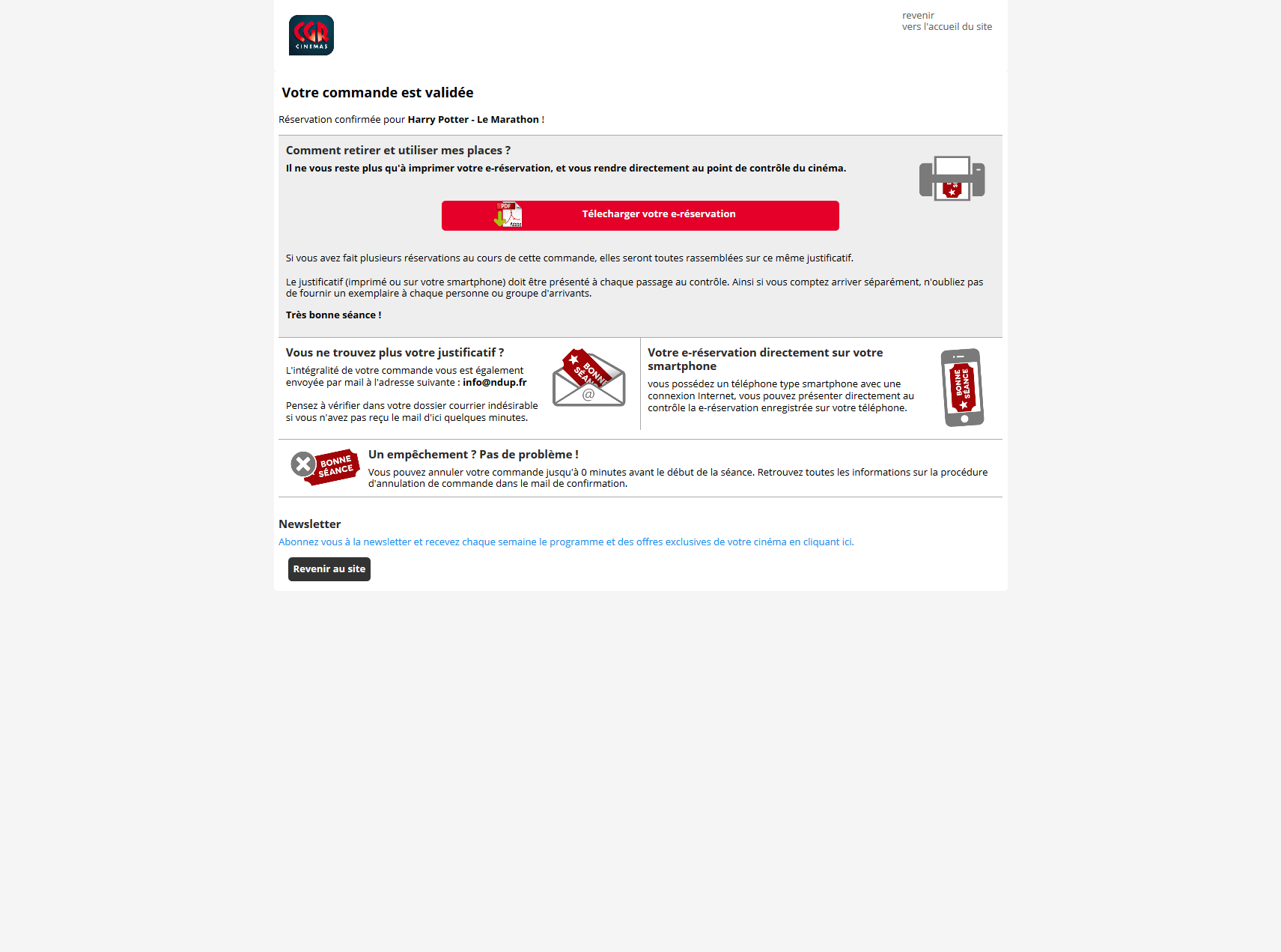
The ticketing component needed lots of help. The confirmation page and confirmation emails are walls of text with no clear call to action, purpose, or hierarchy. It’s not entirely clear how to get your tickets and many of the theaters have mobile apps through which you can receive your tickets, but users would never know trying to parse through this text-heavy page. The tickets themselves are inconsistent as well.
Before
Some examples: an email confirmation, some confirmation pages and a couple of ticket implementations.


After
The goal here was to bring some much needed hierarchy and clarity to these screens. The confirmation page is much more succinct and does what it’s supposed to do — clearly confirm what the user just did and provide the next step for them to take. The email is essentially a version of the transaction confirmation re-oriented around the ticket. The ticket itself, should a user opt for a print out instead of mobile delivery, is much more clean and clear.


