
YLighting is an online retailer of high-end designer lighting. I was responsible for the sitewide navigation redesign, homepage optimization and redesign, creative and product direction, and usability testing.
Navigation redesign
There was a desire to make the navigation more useful by exposing the categories most-looked for and by dealing with the proliferation of items tucked away in unwieldy drop downs. Here’s the before:

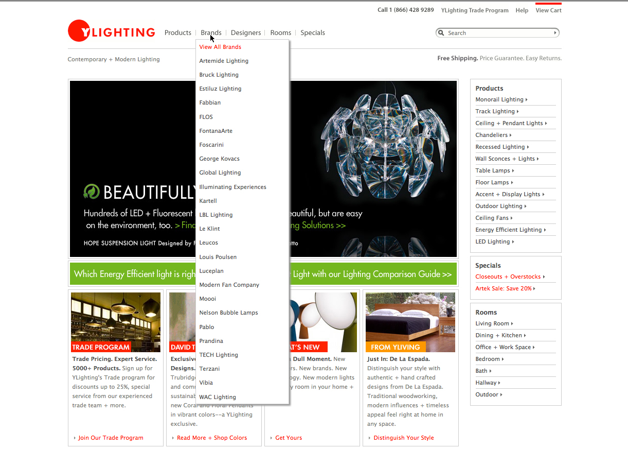
And here is the after. Note the exposed categories and re-organization of the dropdown menus into more usable mega-menus.


What users said about the after in comparison to the before:
"I would have to say a 8. It was a very well designed sight, easy to navigate, great color scheme. Love the top nav bar drop down with images."
"A 9 i like the layout of the page it was easy to get around even without the search option."
"I liked this site...it was NOT busy. A minimalist sort of approach, very clean and attractive for me. While I had not been here before, it was easy to find my way around and not overly commercial in appearance."
"I loved the layout and look of this site. (I rarely use the word love when testing!) Clean and simple design and navigation. Lots of images of products which is great when you can't touch or see something in person."
"I would give it an 8. I thought that the site was easy to navigate and it was very simple to find the category of things I wanted."